
Last updated on November 25th, 2021 at 12:35 pm
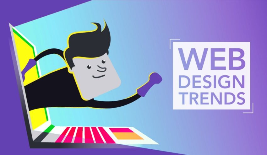
An overriding trend we anticipate in the Web Design Company for the coming year is a greater feeling of playfulness.
Designers have begun to create sites as works of art, interactive projects, and sites that exist just for the sake of amusement and delight. This dates back to the early days of the web when designers were looking for methods to show off new techniques or construct websites for the sake of creating them.
We appear to be in the midst of an early web resurgence. It’s logical. Fashion has also been strongly influenced by the late 1990s and early 2000s. Many of us have been passively exploring the internet at home, seeking something diverting or intriguing, just as we used to do when the internet was initially emerging.
Here are some web design trends that we believe will have an impact in the coming year.
1. Delightful mini-sites
Humor may take various forms, and creating a website that makes people laugh is always enjoyable. Why not have some fun with your construction?
In the early days of Pixar, animators were given time to create a short film alongside each feature film. These shorts were a creative free-for-all, a chance for animators to be more loose and playful without the pressures of feature films. They also produced a slew of innovative techniques that advanced the area of animation. Website developers are realizing that they can achieve the same thing.
2. Scavenger hunts on the internet
The structures of websites actually lend themselves extremely well to riddles and scavenger hunts. You can daisy-chain pages and password-protect specific sections, requiring visitors to offer answers or locate clues in order to access the next page in the sequence.
There are numerous inventive methods for concealing and revealing prompts, clues, and solutions. This is an example of how you can use your web design skills to create an enthralling puzzle.
Here are some suggestions for clues:
- Give a word that is based on a riddle or clue.
- Find a hidden word on your main site or on the scavenger hunt site.
- Locate a page with a hidden clickable feature.
- Make a shape.
3. App-like encounters
Jeremy Beyt, the co-founder of ThreeSixtyEight, feels that smaller, experience-focused sites are the way of the future of online design. “A front-end-driven web experience that’s truly exaggerated from a design sense is a completely new way of accessing the web that hasn’t existed before; it’s an app-like experience,” he continues. That, to me, is the current opportunity.” The world has grown accustomed to apps that feature interaction, animation, and dynamic experiences. The logical next step is to channel that energy into websites and create more one-of-a-kind experiences there.
4. Single-page websites
Sometimes the simplest site is the most effective. We’ve noticed an increase in the popularity of one-page websites, which do away with menus and navigation in favor of simple scroll navigation. One-page sites are most effective when the topic matter is limited, such as a portfolio or the presentation of a single idea.
These websites give the impression of carrying a flyer or reading a poster. All of the information you need to evaluate is in one spot, eliminating the need to navigate or search various pages.
5. Locations that have a strong sense of place
Perhaps we’re all just making up for lost travel time, but some websites appear to be gaining a stronger sense of place. Photographs of locations are being displayed on homepages and about sections, drawing attention to cities, towns, and natural areas near the artists’ homes.
The internet can be a strange realm where you have no idea where the site you’re looking at is originating from. Including a statement such as “crafted with love in…” or including a photograph of a favorite local area enables visitors to imagine where you are and makes a little real-world connection for them. Even though we have been traveling less, we can remember that we are developing connections.
6. Art Deco Motifs
After all, we’re back in the ’20s! Art deco patterns complement the geometric designs that have been popular in recent years. Though many people associate art deco with opulent speakeasy and Gatsby-themed wedding invitations, it can also produce delightfully minimalist designs.
The clean, curved lines and repeated geometric shapes of art deco illustration and architecture inspire this year’s style. These elements may be used to create stunning logos, fonts, spacer motifs, borders, and illustrations. It is helpful to grasp the idea underlying the original art deco movement in order to create effectively in this style.
7. Less imagery in heroes
Rather than depending on pictures or illustrations, many designers this year are creating hero sections and landing pages that speak with design. Hero photos have a strong visual effect straight away, but sometimes removing the distraction of a splashy image allows the focus to shift to style and content.
These four websites by Humain, SVZ, Heyday, and RADAR are all very different, but they all use layout, typography, color, and shape to create a strong, distinct corporate identity. The absence of graphics also adds a sense of mystery, enticing visitors to discover what else lies beyond the hero portion.
Tech World Times (TWT), a global collective focusing on the latest tech news and trends in blockchain, Fintech, Development & Testing, AI and Startups. If you are looking for the guest post then contact at techworldtimes@gmail.com