
Typography plays a crucial role in the development of the visual design. By adjusting typography to your project needs, you encourage readability, accessibility, usability, and overall graphic balance of your content. Considering the growing variety of fonts, it’s getting harder and harder to make the right choice. Below, you will learn seven things to consider while searching for an appropriate font at Master Bundles.
1. Comply with your project identity
When you choose a font, you should have a clear understanding of your project. This will let you communicate its identity correctly. For example, you can brainstorm a few words to describe your topic. Whether it comes to a marketing presentation or university research study, you may want to choose a specific font.
2. Determine an emotional response
The relationship between the font design and the kind of emotional response can’t be ignored. The responses can be of a pleasing, engaging, reassuring, and prominent nature. Design characteristics include naturalness, balance, growth, and value. After viewing the audience’s responses to the selected fonts through impression measures, you will realize that both things deliver pleasant and engaging experiences.
3. Consider shape: geometric vs organic
Modern fonts have geometric and organic attributes in their shape. Futura is one of the most popular geometric fonts which often appear on headlines. It is also widely used in business presentations. Meanwhile, Draft Natural is known as a top organic font that looks great on unofficial projects. Thanks to the amazing variation in the characters, it looks like hand-done writing. So, it easily adds a quirky quality to any design project.
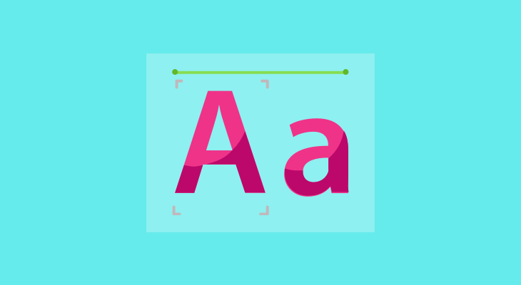
4. Lowercase vs uppercase wordmarks
The audience feels better about lowercase wordmarks, especially when it comes to marketing. The text written in lowercase encourages a better perception of friendliness. At the same time, uppercase wordmarks are more suitable for expressing strength that could boost authority.
5. Convey satire and humor effectively
A connection between particular font traits and emotional effects can hardly be denied. Some fonts look angrier, funnier, and more satirical than others. If you want to create a comical effect, you should find an option that highlights humor in the content.
6. Pay attention to legibility of the selected font
Legibility addresses the design of the font. These include various font attributes, such as the width of the strokes, the availability of novel type elements, and so on. It is easy to distinguish one letterform from another in a legible font. For example, decorative fonts have low legibility as they are intended for fast reading. Just take a look at the headlines in newspapers. They feature specific legibility that refers to the primary content function.
7. Choose between serif and sans-serif fonts
According to the study conducted by the Psychology and Marketing Journal, serif fonts are considered to be more elegant, sensitive, and sophisticated. Meanwhile, sans-serif fonts are perceived as modern, high-quality, and smart. Both types may have a certain effect on the design project. You should choose a font, depending on the emotions that you want to appeal to.
Final Word
When it comes to the choice of fonts, you should forget all rules once and for all. There are no “wrong” or “right” options in the creative process. Are you looking for fun, formal, dramatic, or optimistic tones? At MasterBundles, you will find plenty of font deals that allow you to communicate to your audience in a silent, yet effective way. As you develop your own skills in choosing fonts, you’ll develop the rules that work specifically for your design project.
Tech World Times (TWT), a global collective focusing on the latest tech news and trends in blockchain, Fintech, Development & Testing, AI and Startups. If you are looking for the guest post then contact at techworldtimes@gmail.com
Hi my loved one! I wish to say that this post is
amazing, great written and include approximately all vital infos.
I’d like to peer extra posts like this .
I used to be able to find good advice from your content.
I go to see daily a few websites and blogs to read articles, however this weblog provides feature based content.