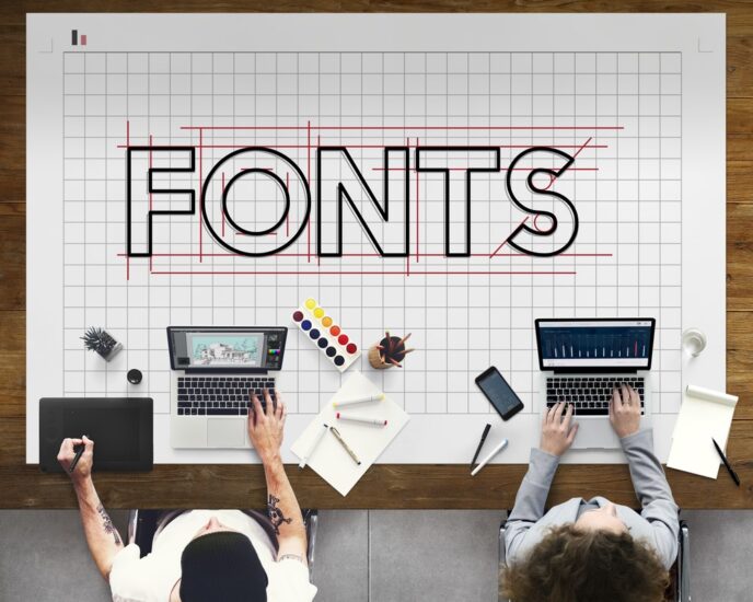
Fonts are fascinating. People love sitting down on their computers and experiment with different fonts of their choice. They like deciding which one looks better than the other. There is a myriad of font choices that it becomes intimidating which one is the perfect choice.
This begs the question, is font choice all that important? The answer is a big YES!
You don’t want customers to view your design and get confused by what is written in the design. That sounds like a red alert for many businesses. Whether it pertains to your logos, slogans, or ads. Selecting the font that reflects your design makes all the difference.
It would be best if you viewed your fonts from the customer’s perspective. See if he can read what you can with convenience. If there are elements where he may misread the content, then you need to remove it immediately. A font can create or break your design. So, you should invest heavily in its usage. We will expand upon why the correct font incorporation in your design matters to you professionally.
Your Design Becomes A Medium of Communication
Your design is an art that is meant to connect with your audience at the mental level. You need to convey your brand’s message to the target customer so that he may get the gist of what you are offering or what your brand stands for. Your font will make it easier for viewers to understand the information in the design of your website and logo. The right fonts will act as a visual medium for the viewers to read the amalgamated colors and texts in your web and brand designs.
Your Design Becomes Attractive
When you select your font, you need to ensure it is as clean as possible. Avoid the small and bit-sized ones that would irritate the viewer. Using easily readable fonts is a viable way to display your presentation. Fonts add merit to your textual content.
With an attractive font embedded in your design, the entire design will have an appealing quality to itself. Viewers will take the time to stop and read your content. It takes the correct font infused with the choice of color and text size to create a visually stunning design.
It Captures the Audience’s Attention
It’s easy to arrest the reader’s attention using visual imagery, but it takes a specific font to convert their attention to interest if you want them to read your content.
You can do so by adding the fonts to the content in which texts have a magnetic element. If used effectively, the fonts will render your design outlook alluring. Fonts and Visual Graphics must always complement one another to form the ideal final material.
Fonts Evoke A Certain Mood or Feeling
Catering to the viewer’s emotional side is not limited to the visual aspects of the design. It also includes fonts. If you want to display your design in a professional and serious tone, then choose plain and simple fonts.
However, if you wish to showcase your design in an exciting, fun, or exhilarating way, you should use creative or glamorous fonts that are out of the box. These fonts will trigger a sense of emotion of feeling in the viewer who will be intrigued by the kind of information about your design offer.
It Creates an Information Hierarchy
Information Hierarchy means arranging fonts with informational texts of content that will showcase their importance. You can use a diverse range of fonts in terms of sizes and types to distinguish the texts from one another, especially those that hold the most importance.
You can also use highlights when it comes to the more important content by using larger font sizes. This will direct the audience to what type of information or font they need to pay attention to.
It Creates A Cohesive Infrastructure
If you remain consistent with your font choice and use the same pattern within your content, you will create a harmonious and cohesive structure that complements your visual design. A mixed-up font usage will cause the entire design structure to deteriorate and collapse. This is why font usage needs to be careful and meticulous.
This cohesive design will effuse the aesthetic effect of your brand. Using similar fonts gives your content equilibrium. With a consistent font, your presentation will come out polished and uncluttered.
Exhibits Professionalism
The right addition of fonts in a design exudes a sense of professionalism. When you display professionalism, it will establish immediate trust with your customers and benefit you in the marketing sector. If you hope to see your business succeed, you need to ensure that your font, color, size, and everything that creates your brand design is professional and sophisticated.
Increases Recognition
If your web design consists of consistent and creative fonts, you will experience more recognition for your brand. The endgame for the usage of fonts is the same as visual imagery. To increase recognition, always remember that your font choice is what will take your business to the next level. The very reason why the right font matters to your design are that you want it to become identifiable for your viewers and upgrade your company’s presence.
Choosing the right font and implementing can be a taxing endeavor. There is also no guarantee that it will succeed. To avoid making that mistake, you can acquire an authentic and credible graphic design services company. They have all the elements and components at their disposal to combine all the correct fonts and present you with a perfected design.
Irtiza Nadeem Digital Content Producer for Designster. He develops and implements content strategies for Designster, along with aligning business goals with content marketing activities. He actively contributes articles related to digital and content marketing.

